Scroll further down to see lots of examples.
A cartogram is a map-like diagram.
A common kind of cartogram is an area cartogram, where the area represents some quantity like population.
The pie cartogram is a kind of area cartogram I created in 2015. Unlike some other area cartograms this does not retain topology or any of the original shape.
The rules are simple: The area of each shape is proportional to the quantity it represents (often population) and the line between any two adjacent shapes is perpendicular to the line between the centres of the real-world regions.
So the pie cartogram is a geographically ordered pie chart, or a cross between a pie chart and a map.
Sometimes regions may be neighbouring in the real world and not the diagram or vice versa. The line between them may or may not look like the real world boundary if there is one.
Simple rules don’t always mean a simple implementation. It took quite a while to write it in 2015-16 (then in JavaScript). In 2023 I ported it to Python. The program is now more flexible but it’s slower.
Any convex polygon can be used as the starting shape. Normally I’ll use a many-sided polygon that looks like an ellipse – a circle if there’s about the same amount of lines in every direction, but if there are more lines in one direction, I’ll stretch the ellipse the other way so there aren’t too many shapes squashed the same way.
In the future I hope to improve it and produce larger ones.
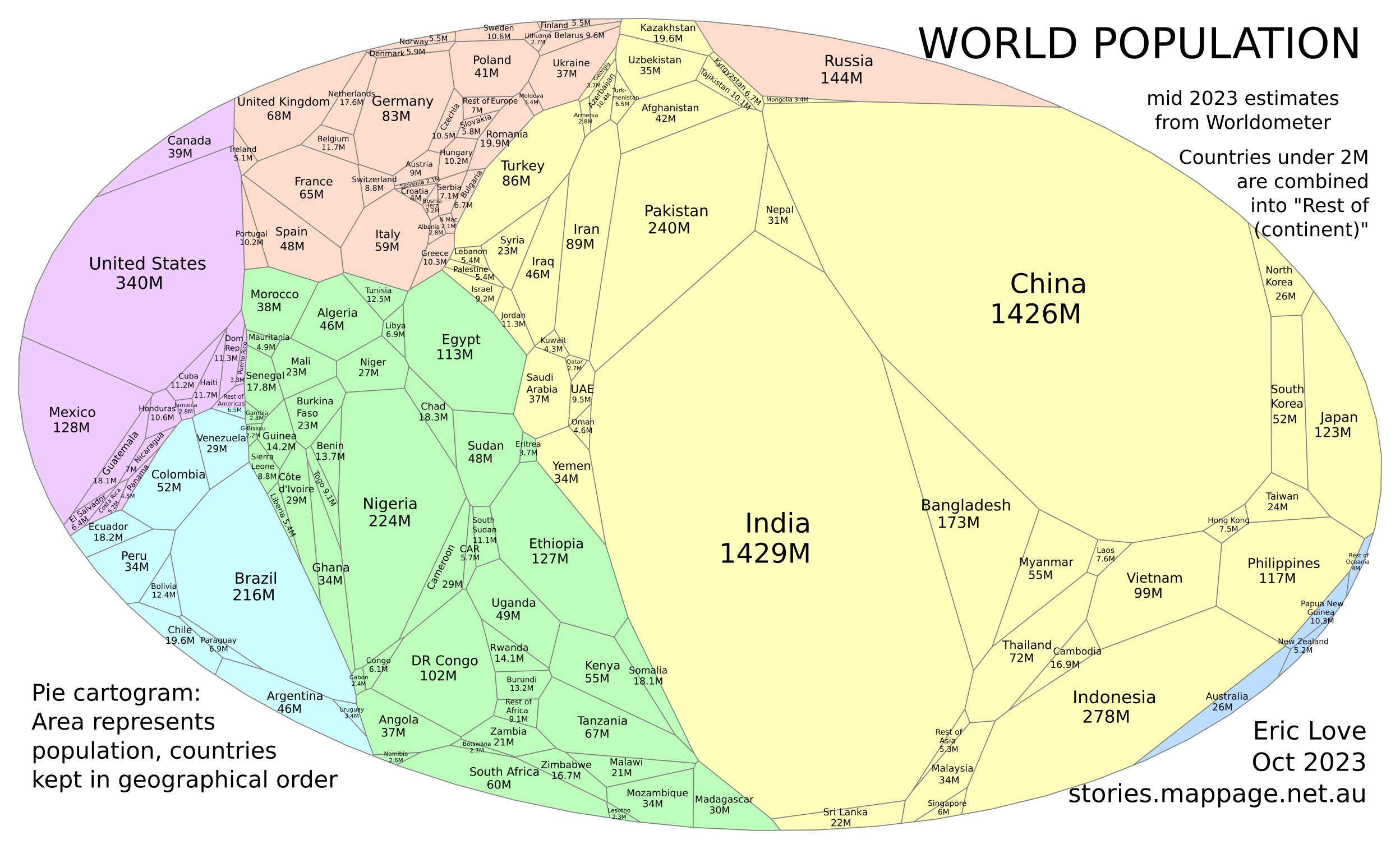
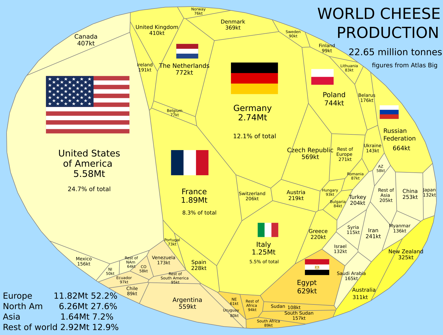
World
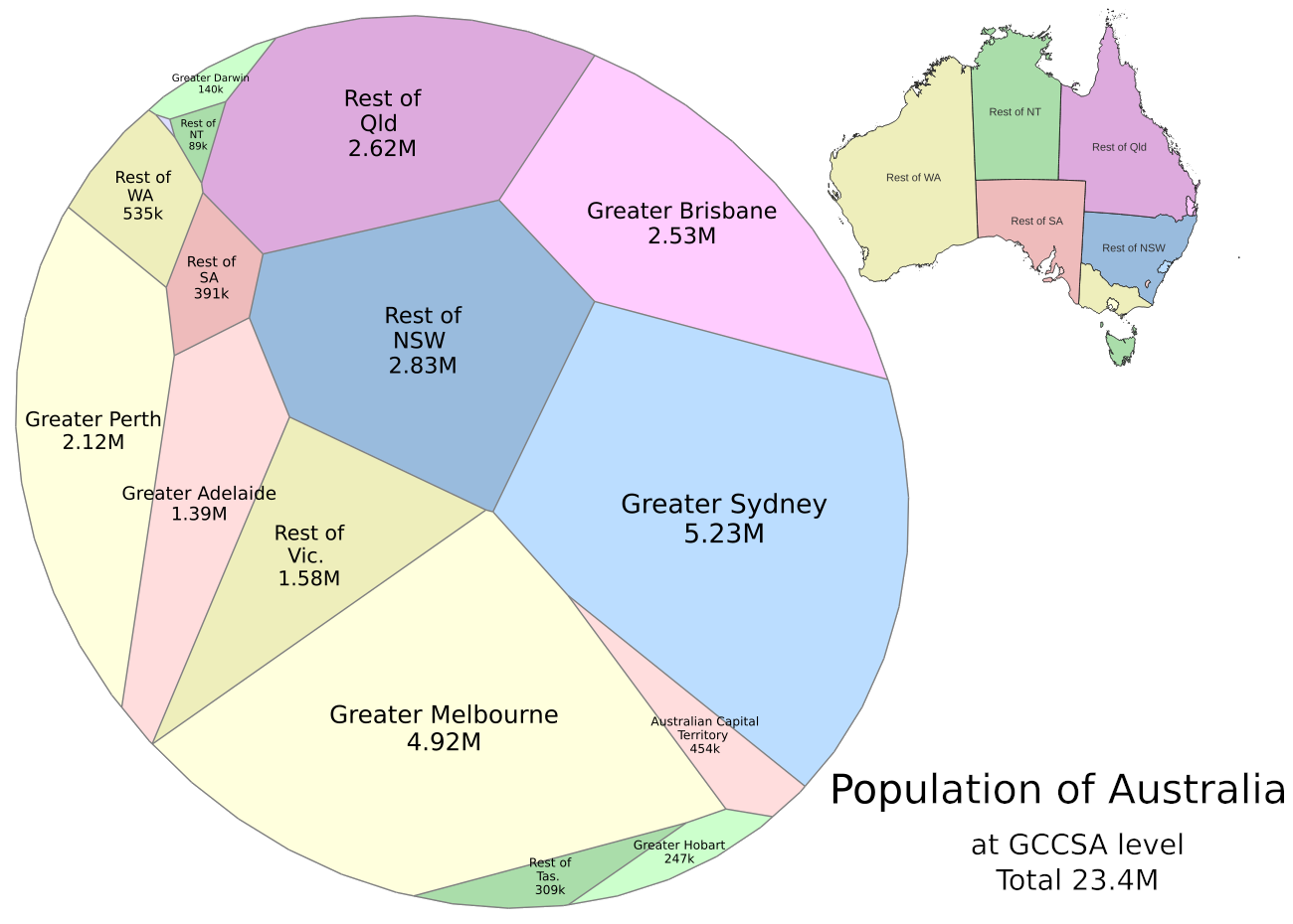
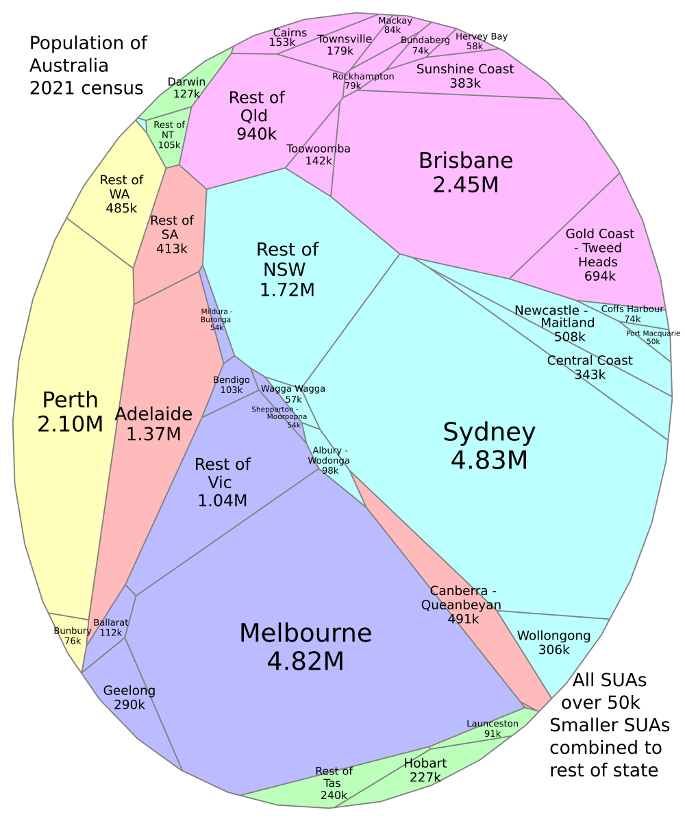
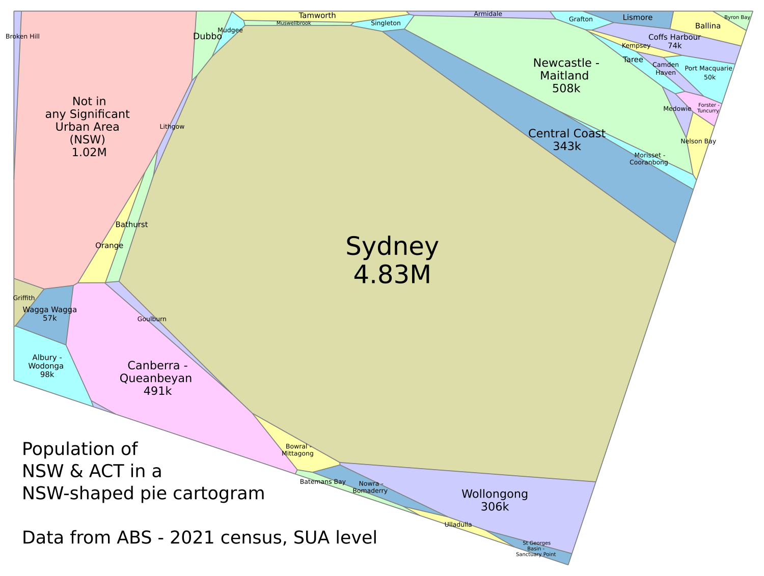
Australia
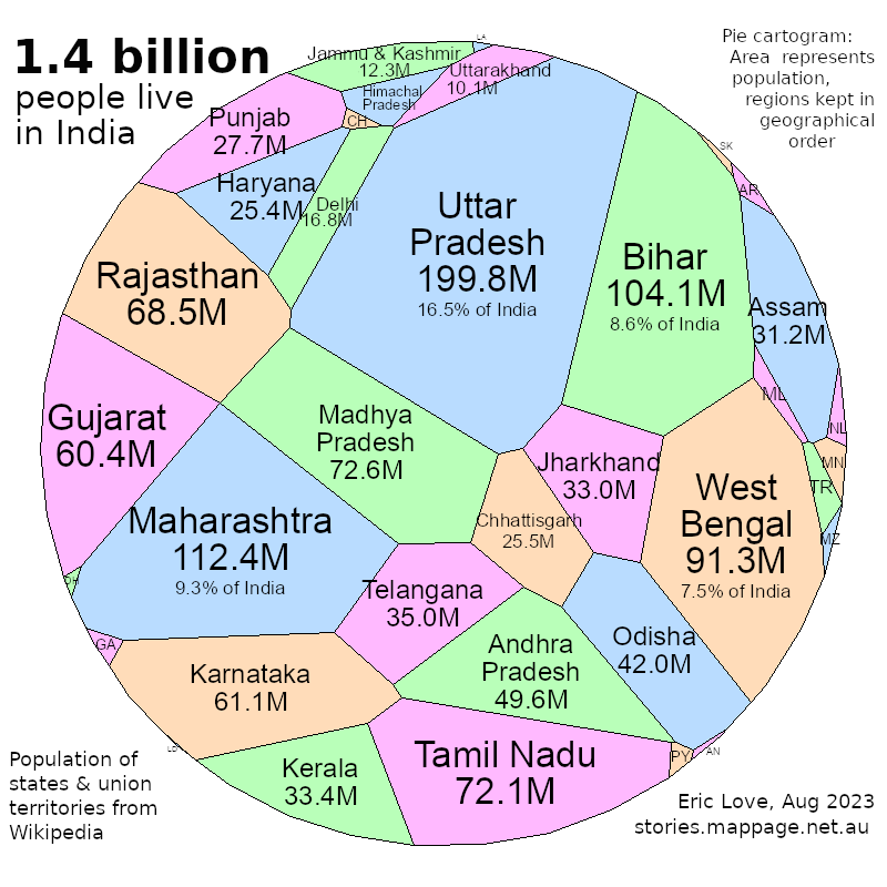
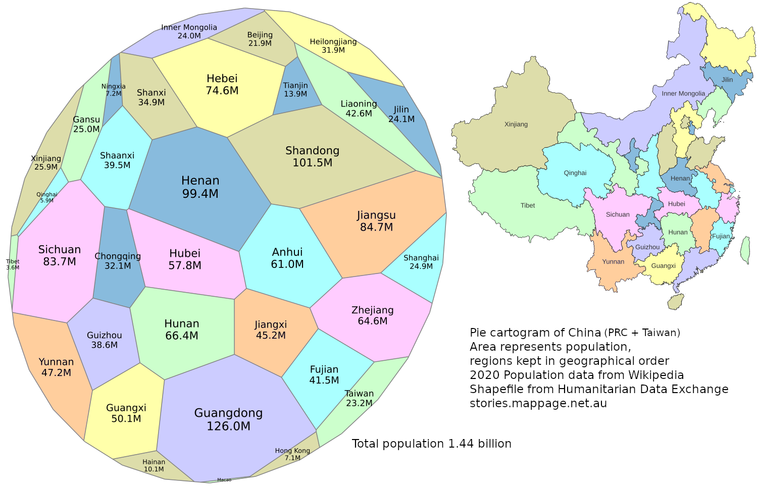
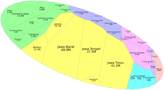
India, China, Indonesia
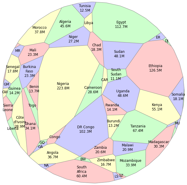
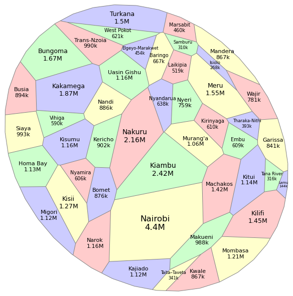
Africa, Kenya
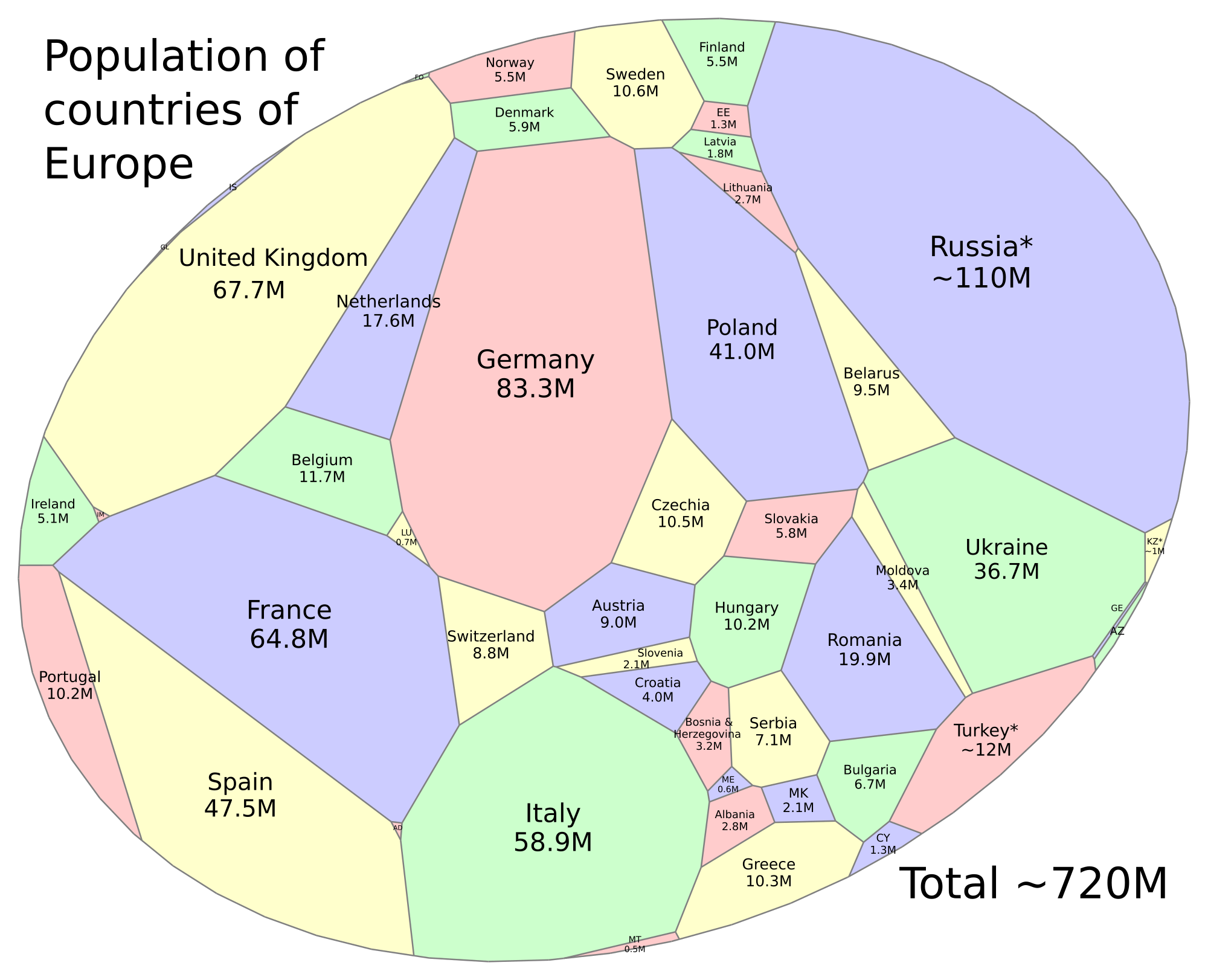
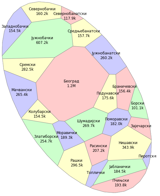
Europe, Serbia
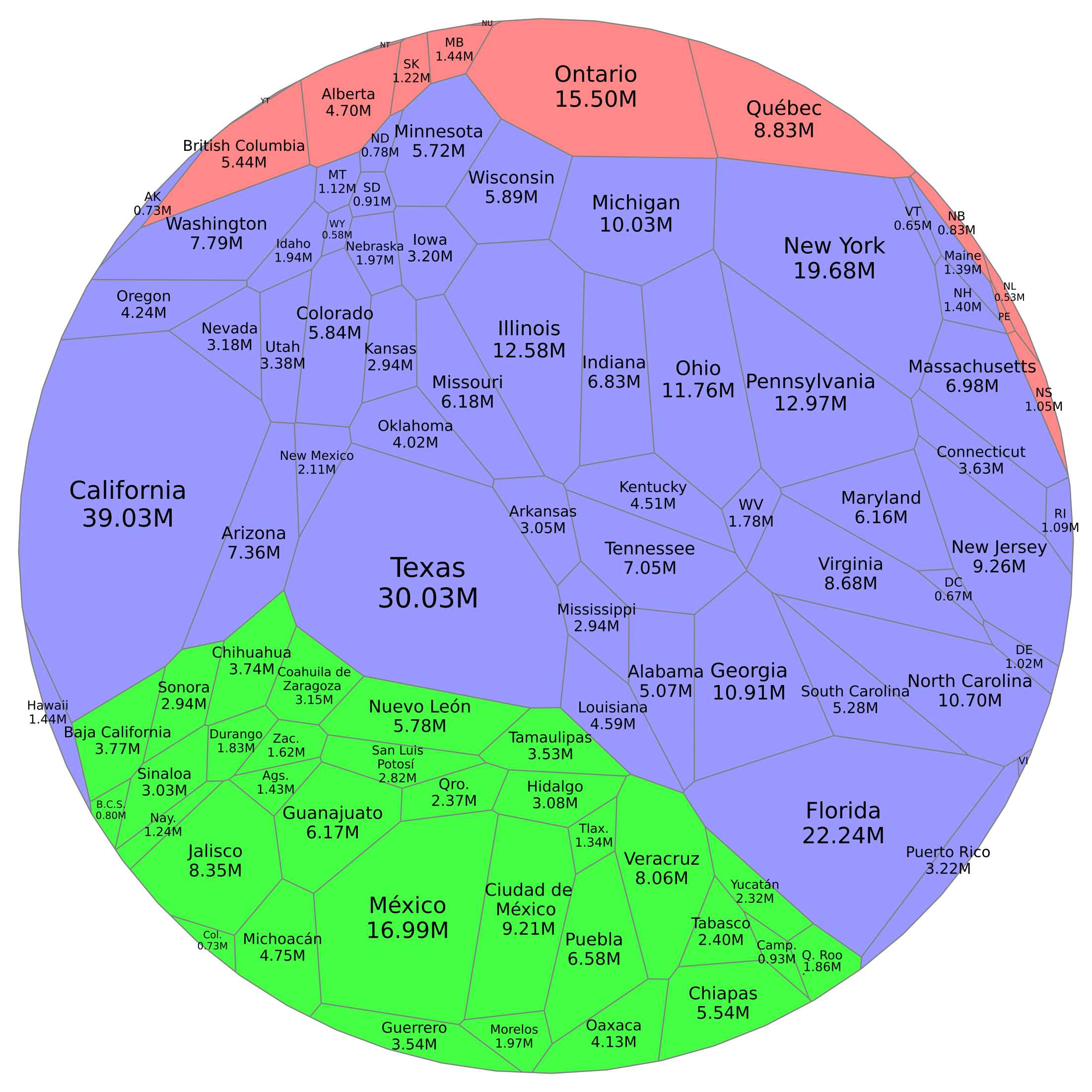
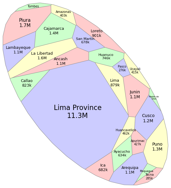
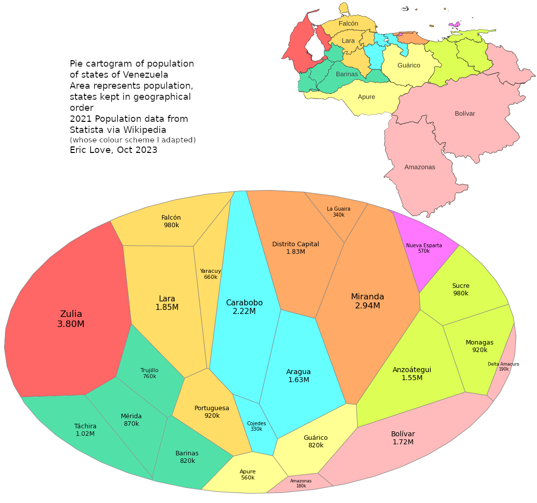
US/Mex/Canada, Peru, Venezuela