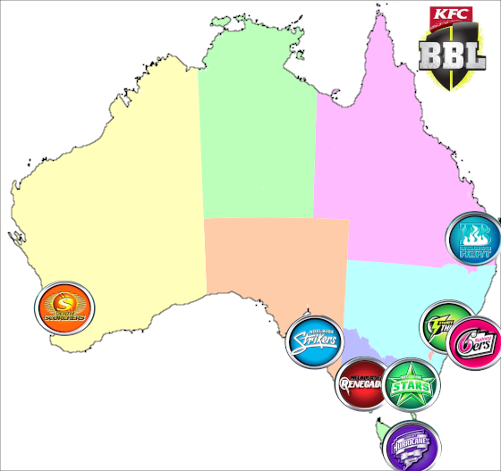
Here’s a map of Australia with the location of the eight teams in the Big Bash League (T20 cricket). Most of them are on one side of the country. Is this only due to the population distribution? We can consider this question by changing the map to a pie cartogram.
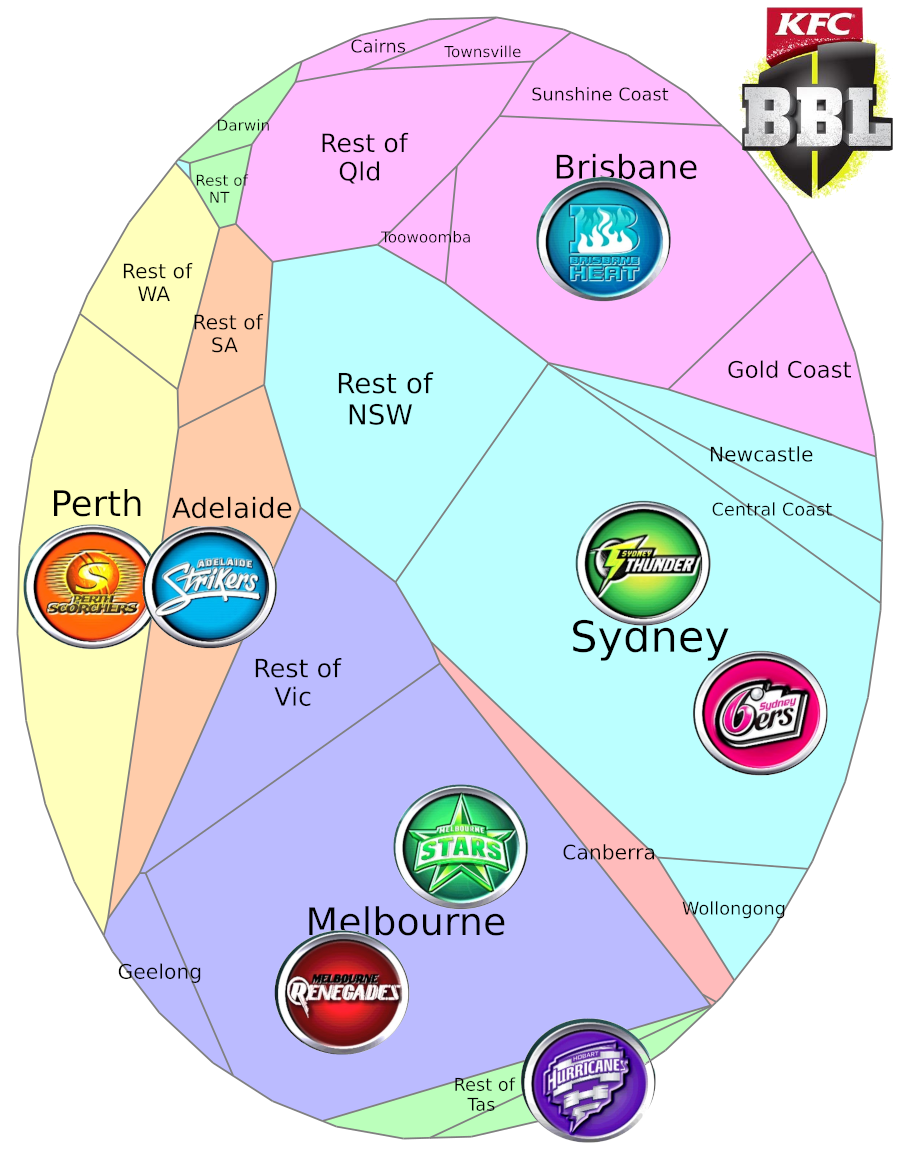
A pie cartogram is a geographically-ordered pie chart. The colours are the same as the map above, but each region is sized by population. Now the teams seem to be spaced more evenly. This reflects cricket being the main summer1In the tropical, less-populated north of the country, they don’t have the summer/winter pattern that we have in the south. In those places, January isn’t the best time to play cricket. The two most northerly teams are already called the Heat and the Scorchers. sport in every state.
But some sports are not so evenly spread…
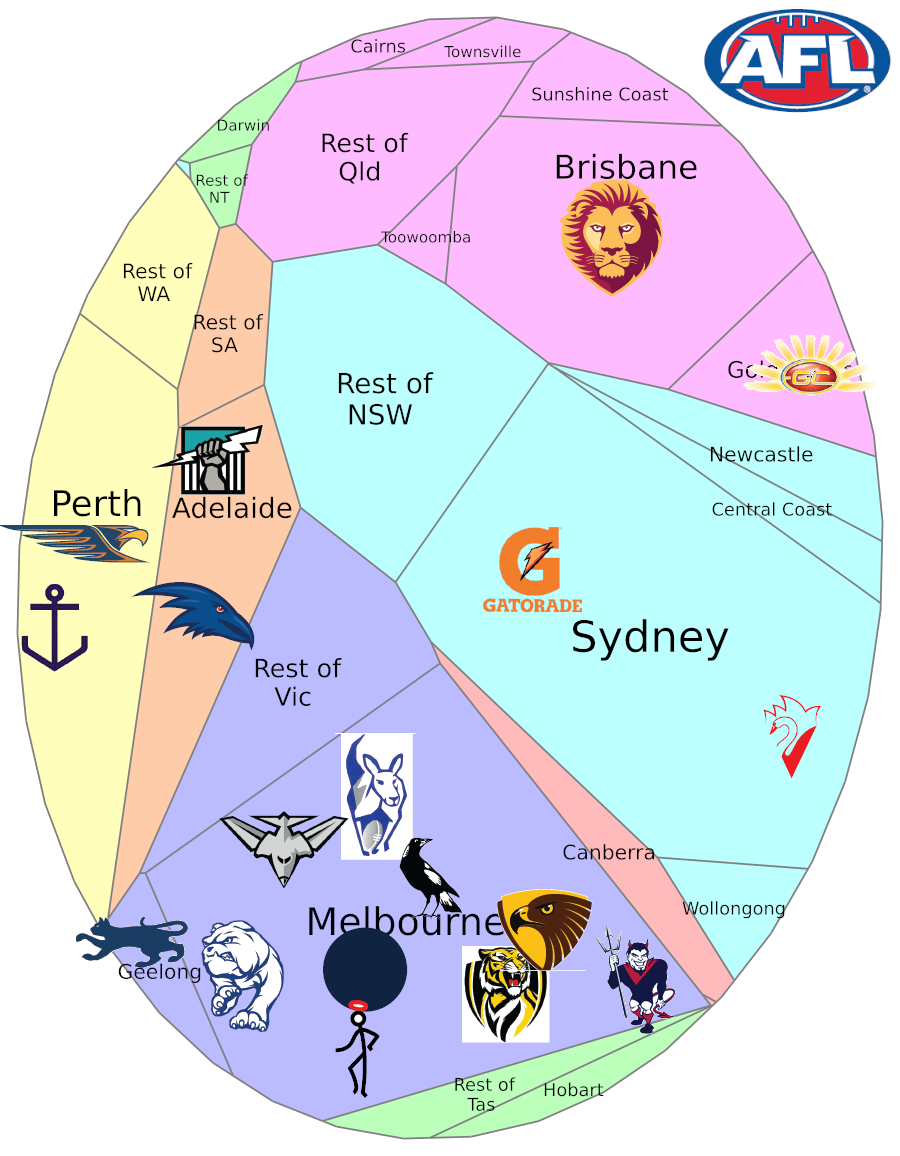
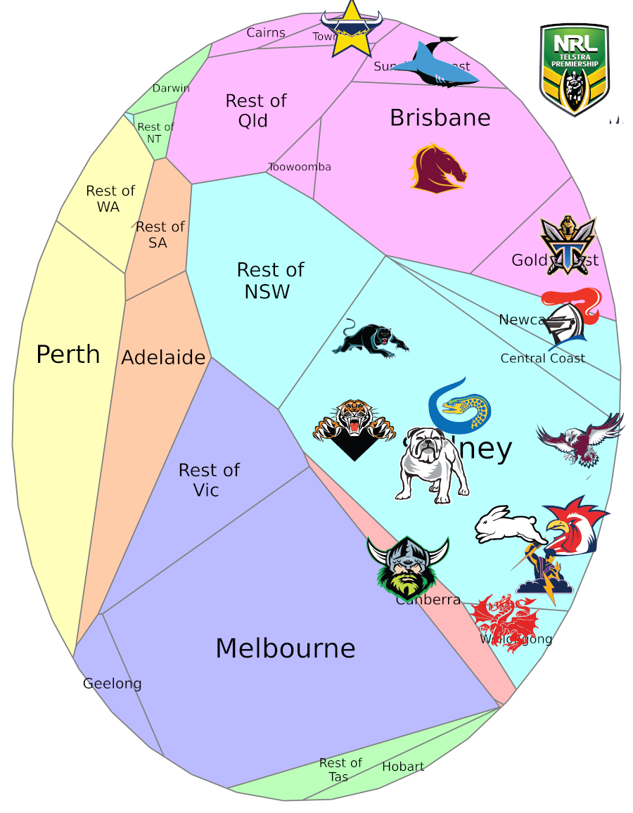
Four kinds of football are commonly played in Australia. In the southwestern half of the country, Australian rules is the most popular sport and this is reflected in where the AFL teams are. In the northeastern half, rubgy league is popular (rugby union is also played there). All the current NRL teams are in that half (except one in New Zealand, which I’m excluding from these images), although there have been a few over our side over the years.
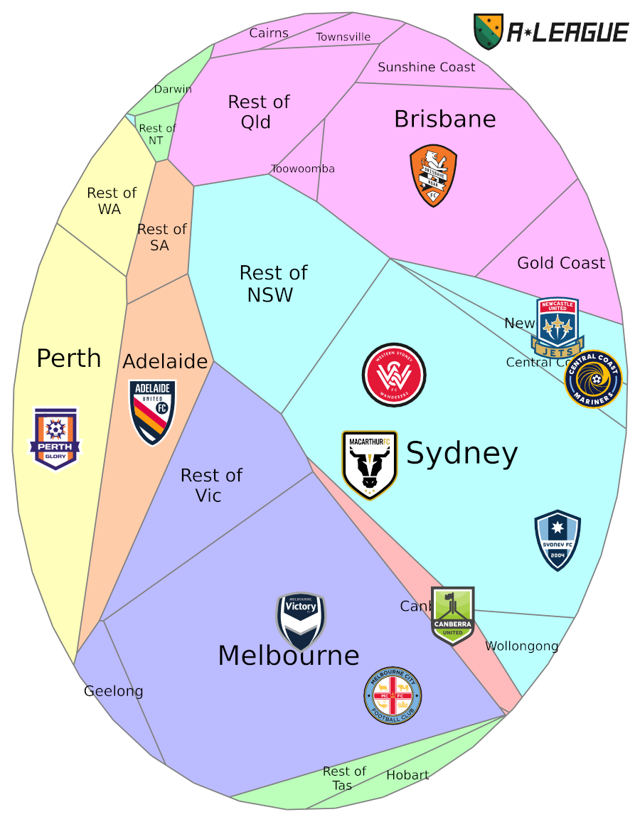
Soccer is played in both halves of the country and the A-League shows a more balanced arrangement. It’s always been the main game for Aussies of southern European background.2Look at the names in the men’s national team over the years and you’ll see plenty of Italian, Greek, former Yugoslavian and now African names. But the women’s team – which usually ranks higher than the men – better estimates the ethnic mix of Australia, perhaps because many girls played soccer growing up rather than the more injury-prone Aussie rules and rugby their brothers played. We see the same in the US, where many boys play American football, while more girls play the less hazardous soccer, and their women’s national team has won World Cups.
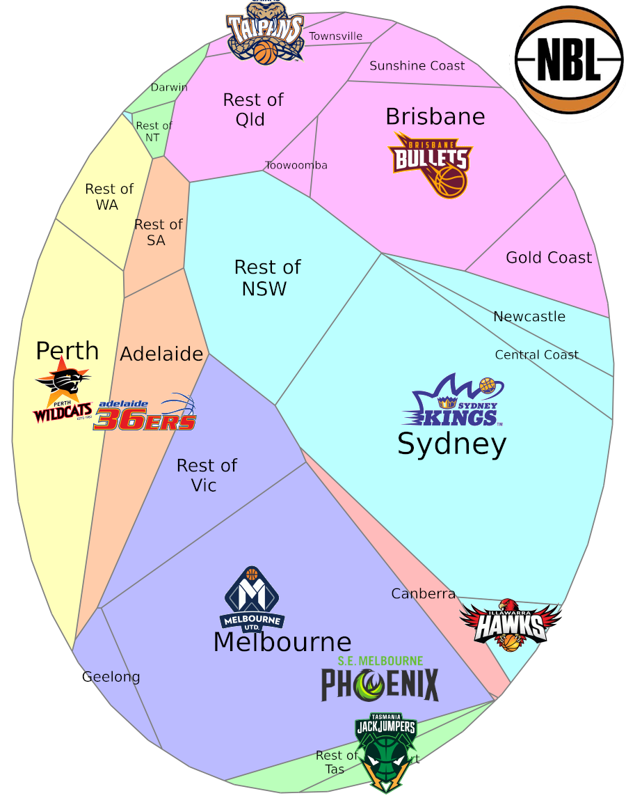
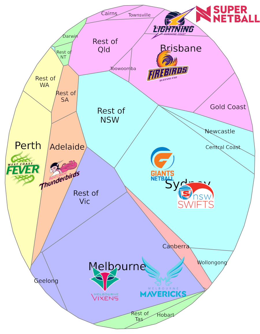
The teams for basketball and netball have varied over the seasons. While the five big cities have usually had NBL teams, there have also been teams in Newcastle, Geelong, Gold Coast, Townsville, Darwin and Canberra. The teams shown for Super Netball are for next year, with the Mavericks replacing the Magpies, who were also in Melbourne.
That’s it except for all the details I don’t want to omit. Many big-city-based teams will move an occasional home game to somewhere no team is based. The Melbourne-based AFL clubs go back to the days when Melbourne was much smaller, so many of them bear the names of inner suburbs. In the cartogram I spread them out over Melbourne partly in the relative directions of those suburbs. Historically some of them might have later based themselves in outer suburbs, but I haven’t followed that far enough3except noting that the Demons were in Casey. Likewise I think I’ve got the Sydney NRL teams vaguely right.
More about pie cartograms here. The “Rest of” areas, though they form a block in the upper left, mostly represent populations near the coast in the different states. The regions shown are Significant Urban Areas4One of the many geographical levels defined by the ABS., except SUAs smaller than 100k have been grouped with the remained of their states. The colours don’t exactly match the states5The regions labelled Canberra and Gold Coast both include people in NSW. I used a tall ellipse because a circle would end up with more narrow W-E areas6Including more smaller SUAs would have also made this worse with many of them along the east coast..
I could have extended some of the cartograms to include New Zealand, which has one team each in the NRL, A-League and NBL. In that case I would have wanted to do the Trans-Tasman Netball Cup, which had five teams each in New Zealand and Australia. Then if I was using historical team distributions, the NBL would have warranted an animated version than went through the years and that would have been too much.
If anyone points out any mistakes, I can fix them. If anyone wants to create something like this for another country I can help you with that. Meanwhile, I want to map out which parts of Adelaide write more letters to the editor per capita…