In this article I look at how the vote in the 2023 Australian referendum varied geographically. Plenty of others have done this in the last few days so there mightn’t be much new information. I’ll leave the political side of things to others; this’ll be mostly just stats.
If you’re reading this on a large screen, you’re best reading the Mappage version, where you’ll be able to see some cool charts & maps. If you read on here, you just see references to them.
This article is available both here (best for large screens) and on my WordPress site (best if you’re reading on a phone). This isn’t just an article with some graphs thrown in; it’s my stats engine (called Mappage) set up for this article. Clicking any of the one-letter links will show maps & charts. It’s very multi-purpose rather than being optimised for this article and it’s a bit messy & buggy with some of the things I’m showing here, so hopefully you can follow it.
Media reporting of the votes that I read was at the level of electorates. There are 151 of them, which doesn’t give a detailed picture. The results data come broken down into 6974 regular polling places, 1218 pre-poll voting centres and 543 records from mobile & hospital teams (which attended multiple locations).
M ul51mafx First, here’s a map of Australia showing the proportion of formal votes (excluding pre-polls, so numbers will be slightly higher than the overall results) that were Yes in each area. If you zoom in, it will show will show more detail, all the way down to SA2 level. Move the mouse around the map to see details.
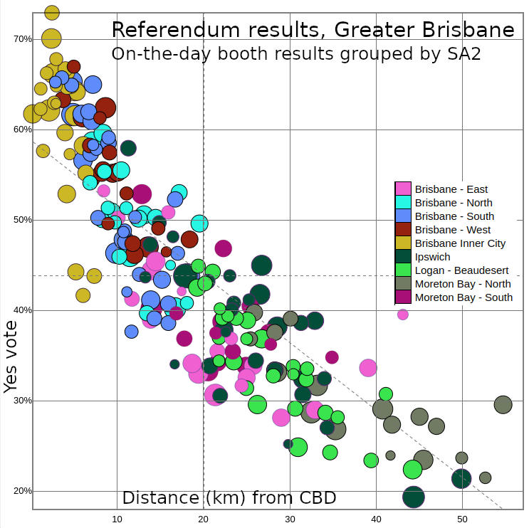
Zoom into any major city and you’ll see the CBD is strongest for Yes, while No increases as you go through the suburbs and into the country.
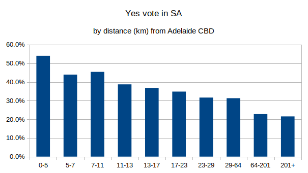
Before I got into the complicated stuff I’m describing here, I made a quick plot of the votes in South Australia broken into deciles by distance of polling places from Adelaide CBD. I shared it on Reddit and some people suggested comparing with things like education and income.
We can use scatter plots to compare the way an area voted with any demographic variable measured in the census. O j6fczixt In this plot, the y-axis is the Yes vote; the x-axis is the proportion of residents in the area with a degree; each circle is an SA3 (coloured by state and sized by number of votes). Move the mouse over the circles to see details about them.
There’s a slope of 1.06, which means an extra 1% of the population having a degree is associated with the Yes vote being 1.07% higher. The correlation of 87% means that if you knew how educated the area was, you could estimate its vote fairly accurately.
You can’t use this to estimate the overall Yes % of voters with degrees. To do that or see how the vote varies by any other demographic category, you’d need a survey such as an exit poll that also asks demographic questions. All the comparisons I’m doing here are indirect1Except distance from CBD – not everyone living in a rich area is rich, but everyone in Paralowie is roughly 19km from the CBD. – we know what the votes were cast in each area and we also know a lot about who lives in those areas. Also note that not everyone voted at a booth in the SA2 where they live, but I doubt that introduces much error.2Most people who voted on the day would likely have voted in their home SA2 and many who didn’t would have been in a neighbouring one. At SA3 level the error would be minimal. The same doesn’t apply for pre-polls – there were fewer of them, so more SA2s than not didn’t have them, which is why my analysis here excludes them.
You can click “Place / Residence” on the right then click a state to see just the results for that state. They will probably break down to SA2 level.
O bwlrt6qv This one puts income on the x-axis. An increase in an area’s median weekly individual income of $100 was associated with an increase of 4.7% for Yes. This effect was greater within SA and Tasmania.
O f61u4vx2 In this scatter plot the x-axis is the Index of Advantage and Disadvantage (which bundles several demographic variables into one number), with the poorest places on the left and richest on the right. There’s a substantial slope – increasing the Index by 100 increases the expected Yes vote by 14%. There’s a correlation of 75%.
If you click SEIFA then “Education and Occupation”, this changes the x-axis to the Index of Education and Occupation, a similar index to the previous one but highlighting areas with high education and high-status employment, the slope stays the same but the correlation goes up to 84%.
There’s a lot of correlation between income, education, proximity to CBD, so having these all correlate with the Yes vote is unsurprising. There are also more young adults and fewer families in those areas.
More scatter plots comparing with different variables from the census. O zwpf83k1 Speaking a language other than English. O 063dxolw Non-religious. O 72xims04 SA2s in Brisbane by distance from CBD. You can click Place and choose any of the other capitals.
O t6v59sid This one compares with the proportion of indigenous residents in an area. Areas with 5-20% indigenous people had bigger No votes than those with under 5%, but those with a lot more were better for Yes. This is clearer now that I’ve included mobile vote data3I originally couldn’t find the locations they had been. A high indigenous proportion correlates with an area being poorer, which correlates with a stronger No vote, so I’d have to look closer to see whether there’s any additional effect.
In any of the charts above, you can click “d_au_aec_ref23.ppt” and “5” to see the pre-poll votes instead of the others, or “+” to see votes in all categories41 = regular, 2 = hospital, 3 = remote, 4 = prisons/other, 5 = pre-poll.
There’s no end to the angles you can look at with. This has been a good exercise to stretch the capability of Mappage, which I have mostly used with census data. Let me know if there’s anything like this that you’d like to see.