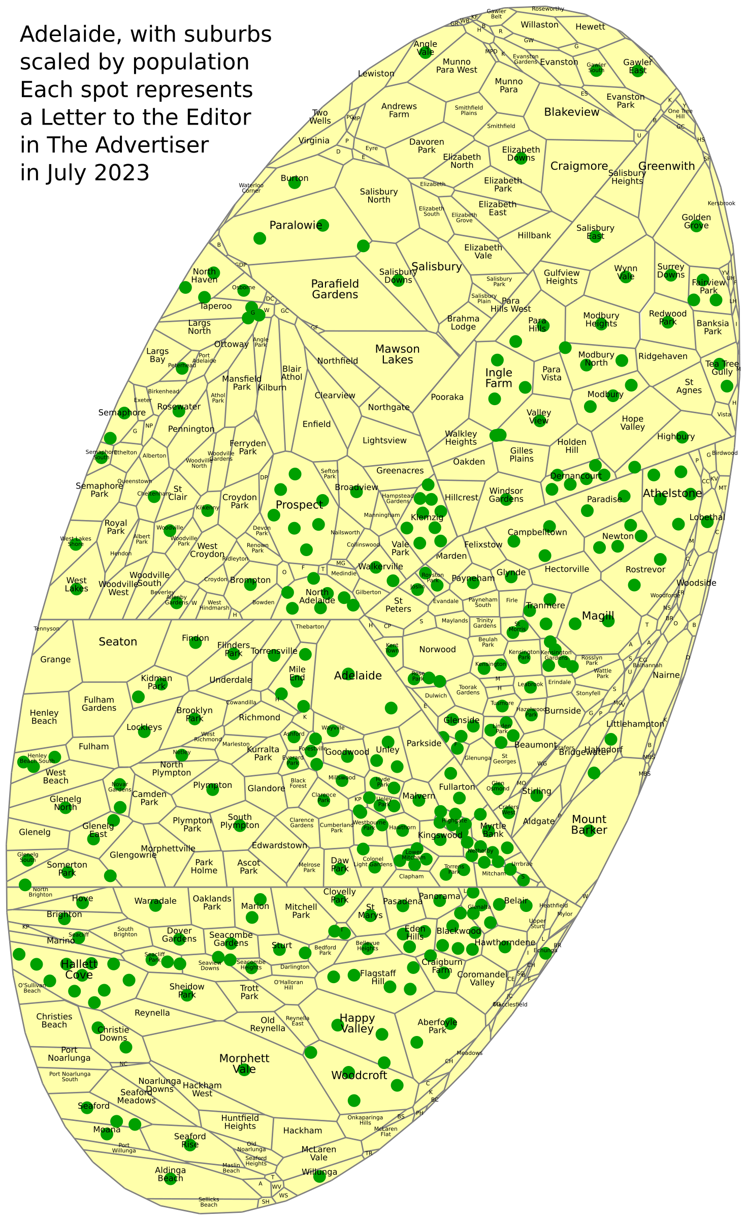
This is a composite pie cartogram of the suburbs of Adelaide showing where people live who wrote letters that appeared in The Advertiser. That’s is all there is for the short version.
Now for the long version. This will be a commentary on data visualisation from my perspective, then a brief analysis of the actual data.
Putting data on a map
The Advertiser, Adelaide’s main newspaper, has a letters page with around 14 short letters sent in by readers, typically with the sender’s name and home suburb. Throughout July I recorded these suburbs in order to create the cartogram above.
If, rather than specifically wanting to show a certain kind of diagram, someone had this list and wanted to convey that data in some way, what would they do? A simple starting point would be a simple list with the number for each suburb, like this:
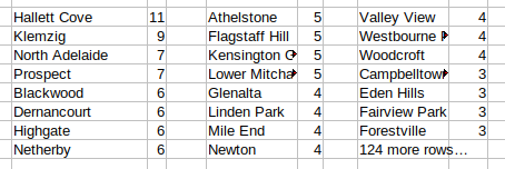
You could also do it alphabetically, or group them into LGAs so there’s only 20 in the list instead of over 100 (not counting suburbs with none). But it’s not that useful to look at. Since these are places we’re talking about, it makes sense to put them on a map.
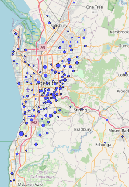
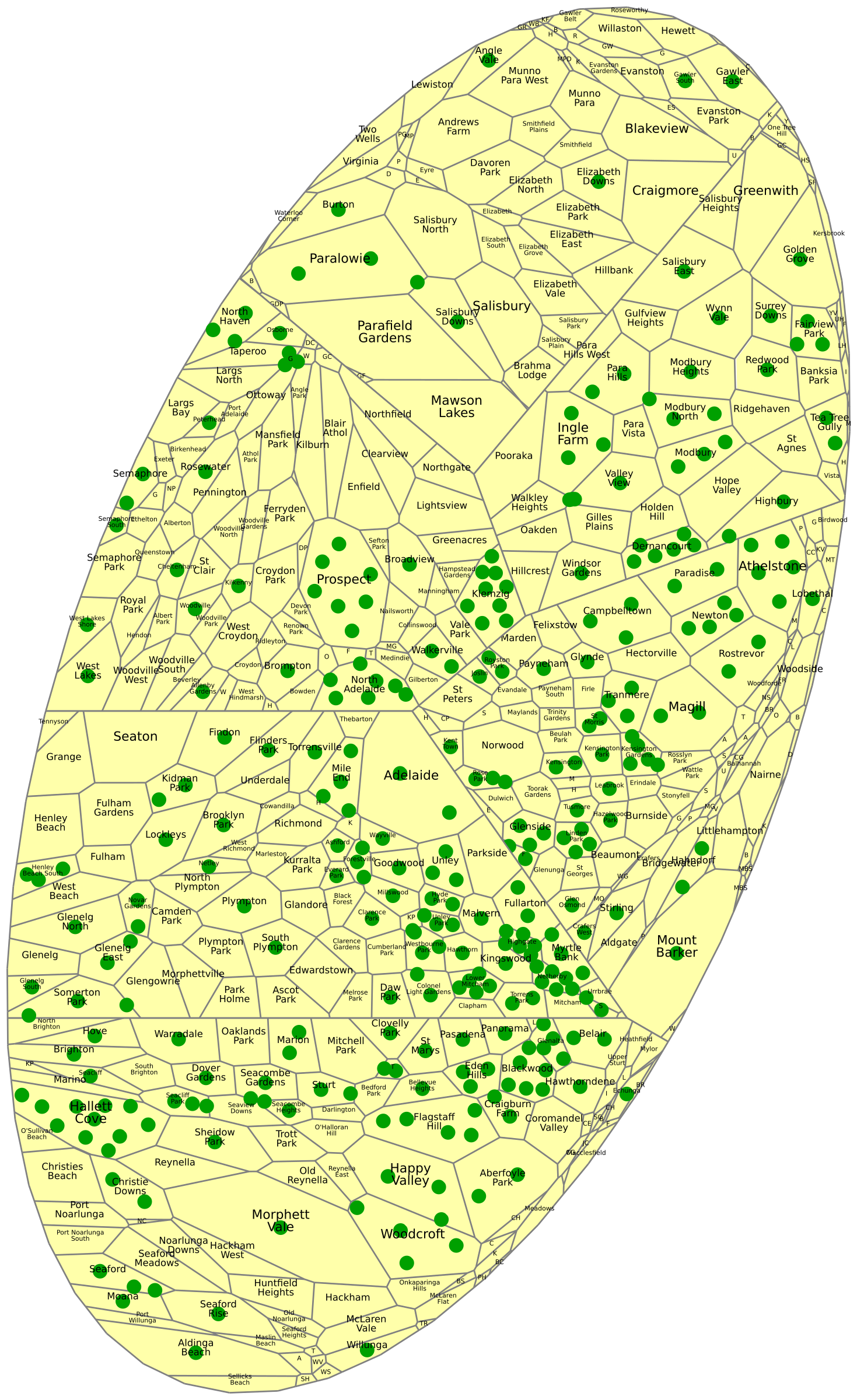
The small spots are a single letter. Larger spots represent a larger number of letters, although in some cases a single contributor may have written many of them – there are some names that turn up on a weekly basis. This shows us that there are a lot from the inner suburbs, particularly the south. If it’s a map for sharing on the web, you can make them so that you move the mouse over a spot to see more info.
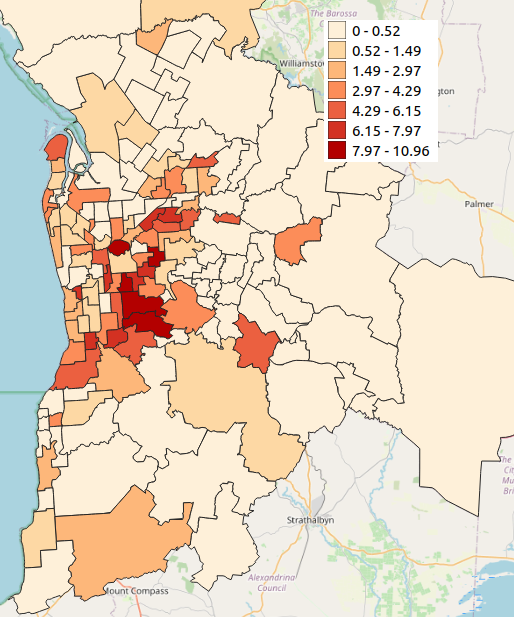
Because the spots represent the home addresses of people, it makes sense to compare those number of letters from different areas with the numbers of people living there. Are there lots of spots in the inner south simply because many people live there? Are the hills relatively empty of spots because they have relatively few residents? What about the northern suburbs? We can make a map showing the number of letters per 10,000 residents (2021 census):
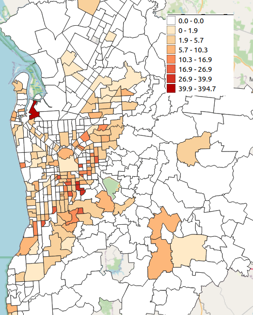
Now we can see that the inner suburbs, particularly the south and east, are indeed producing more letters to the editor per capita than the north and the hills. While Hallett Cove topped the list before, it takes a back seat to a number of darker suburbs and it about the same shade as the Mitcham area as a whole (or is it? – it’s hard to tell). While dividing by population does make this more useful than before, it has the risk of being thrown off by an outlier with a very low population – in this case, Gillman with 3 letters (possibly by the same person) from only 76 residents.
We can smooth things out a bit by aggregating to postcode level.
I think this looks better. The five highest postcodes are all at a similar level. We could also put numbers in to show how many letters and see how many letters in each region (or we could make the shading translucent and keep some of main roads or place names on the map to better recognise the areas). The only thing we can’t see is what population is represented by the light areas. That’s where the pie cartogram becomes useful.
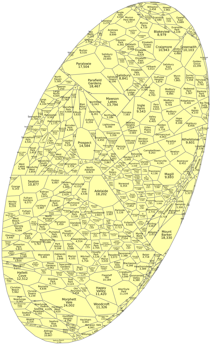
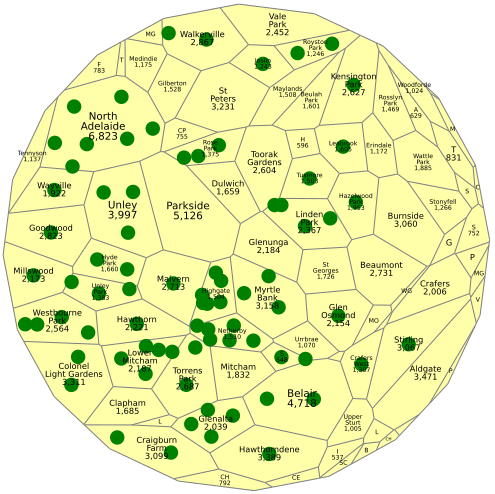
A pie cartogram (more about them here) is made up up polygons whose sizes represent something (typically population) and kept in rough geographical order. My program struggled with more than 150 regions, so this is actually six cartograms stuck together – you can see straight lines roughly following Main North Rd, the Torrens, Grange Rd, Glen Osmond Rd and Daws Rd. Suburbs across these mightn’t match, but within each section, every suburb is in the right place relative to its neighbours as much as the constraints of the overall shape allow. If I’d used postcodes rather than suburbs, I could have done it all in one. Small population areas don’t show up very well (we don’t want them too). Some places get squeezed into awkward shapes, particularly in the hills in this case.
So here’s my final product again. It shows us the numbers of letters and the relative populations of parts of Adelaide. It also lets you see the ‘density’ in either a single suburb or a group of nearby suburbs, while a coloured map makes it harder to judge an ‘average’ across neighbouring regions.
I only included suburbs in Adelaide GCCSA/SUA. The rest of the state would have presented more difficulties, with the number of regions in the cartogram (and more of them squashed around the outside) and several writers using the name of their town rather than the smaller locality within it. I also excluded letters where the location suggested an organisation rather than a home suburb. I didn’t include the shorter messages on the letters page sent in by SMS, though some of them indicate a location.
Analysis
So, for my actual analysis. The most obvious thing is that the letters come from rich areas. So I broke down Adelaide by socio-economics…
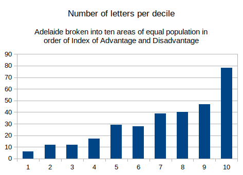
I expected something like that, but not such a big top decile! The top tenth writes a quarter of the letters printed; the top quarter writes half of them; the top half writes three quarters. So what else can we find? We probably need to look within different socio-ec bands now. Here are just the suburbs of that top decile:
Unley and Mitcham LGAs beat Burnside and Adelaide Hills. That might reflect an older age profile and/or more ethnic diversity east & north of the CBD than south of it. Now a quick look at the middle 20% and the only map you’ll see today with Aberfoyle Park next to Mt Barker.
While the arc of spots from Kidman Park to St Marys looks cool, I don’t discern anything significant here besides noting the large number in Klemzig, most of them from a single writer.
I presume are that while many people might read the paper, people will likely only write a letter if they’re reading it often. I’ve only written in when I’ve been living somewhere that gets a paper regularly. Newspapers are read more by older people while younger adults get news from TV and internet. Kids don’t read The Advertiser much nor their busy parents write as many letters as their grandparents. For a given age group and socio-economic status, I would expect people of non-European background to be under-represented too (which could also be noted from the names).
I posted this on Reddit titled “Which areas write letters to the Advertiser?” and multiple people commented that it should specify that it’s letters that are published. While I have no idea how many letters are submitted (except that maybe half those I’ve written have gotten in), I would hope that those published would be a reasonable cross-section of those sent (or at least the geographical distribution of their senders is). I would expect a bias towards letters that are well-written and short; and against those easily rebutted or saying the same thing as other letters. I can see how that could result in the inclusion of more letters written by more educated people (and therefore the areas they live in).
My process was not rigorous. I should note that there were 5 letters marked “Adelaide” and I arbitrarily changed it to 2, thinking that while some of them may have been written by CBD residents, others might live anywhere in metro Adelaide and not wishing to specify their suburb. Had I left it as 5, the city centre would have looked similar to the suburbs around it. I made similar editorial decisions in other cases and likely made a few transcription errors along the way.
The Advertiser, stats fails and my letters
There’s an interesting tie-in in as I write about statistical analysis and letters to the editor. My two main “mainstream media” news sources are the ABC (via their website) and The Advertiser in print. The ABC generally handles statistics sensibly, while the ‘Tiser has often made the #1 beginner error, sometimes inducing me to write a letter to the editor.
The front page one day in 2011 announced that postcode 5108 had the more welfare recipients in every category. 5108 is the postcode with the highest population in the state. Another day we read that Morphett Vale topped the list of solar panel installations. Morphett Vale is the suburb with the biggest population in Adelaide. One article more recently listed the 10 suburbs/localities with the most divorced residents – 9 of which were in the top 10 for overall population! If you ever see an article that mentions Morphett Vale, Mt Gambier or Onkaparinga, read closely and see if they’ve done it again.
You can get away with it to some degree if the district in question is an electoral district (they have roughly equal numbers of voters, at least within each state, for reasons of democratic fairness) or an SA2 (they’re roughly the same size). In some states SA3s are like that (and even LGAs in Melbourne were like that last I looked) but in Adelaide, the SA3s are based on the LGAs and Onkaparinga is largest by some margin1It was formed by the merger of three LGAs, where the largest, Noarlunga, was between the other two, so they couldn’t just merge the two smaller ones. For similar reasons there’s no neat place to break it into two SA3s..
A print publication is definitely at a disadvantage. If I’m alerted to an error or a relevant point I’ve missed on a site like this, it can be fixed in minutes.2I’ve made lots of changes to this piece in the hours after putting it out there. Once the paper is sent off for printing, there’s no fixing it.